
Bookshelf Decor Ideas That Actually Work (Styling Guide)
Posted by graues on 08.04.26
Bookshelf Decor: How to Style Your Shelves Like an Interior Designer
There's something genuinely satisfying about a well-styled bookshelf. It's more than storage — it's an opportunity to display your personality, favorite reads, and collected objects in one curated, visible space. But getting bookshelf decor right takes a little finesse. Too much and it looks chaotic; too little and it feels cold and unfinished. The sweet spot sits somewhere in between, and finding it is more straightforward than most people think.

Whether you're working with built-ins, a freestanding unit, or floating shelves, the same principles apply. You're balancing visual weight, varying height and texture, and leaving enough breathing room so the whole thing feels intentional rather than crammed. This guide walks through all of it — from foundational techniques to themed approaches, lighting, and the practical habits that actually make a difference.
Key Takeaways
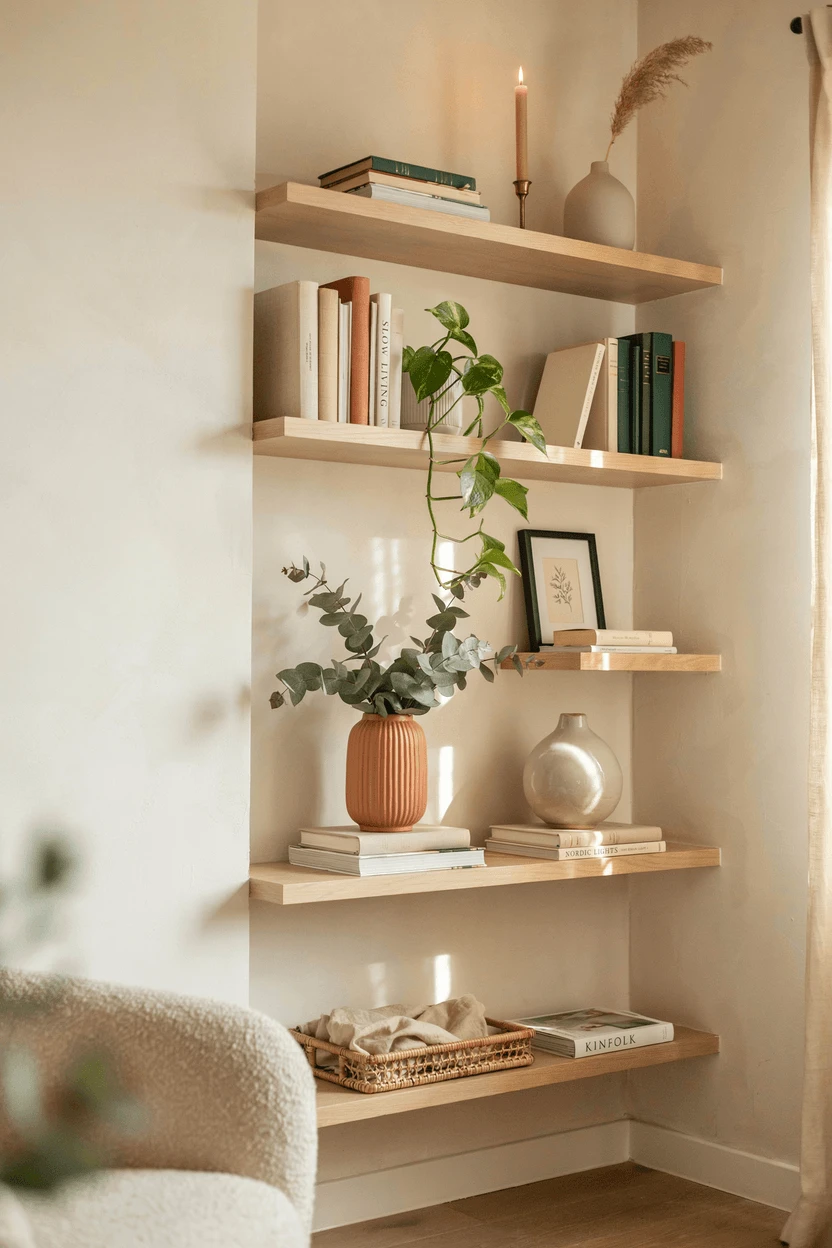
- Aim for roughly one-third books, one-third decorative objects, and one-third open space for a balanced look.
- Vary heights and textures across shelves — sameness at every level makes the eye stop moving.
- Group objects in odd numbers (threes and fives) for a more natural, dynamic arrangement.
- Layer items front to back rather than lining everything up flush — depth transforms flat shelves into styled vignettes.
- Leave intentional negative space. Overcrowding is the most common bookshelf mistake, and removing about 20% of what you've placed almost always improves the result.
Understanding Balance and Visual Weight
Think of your shelving unit as a grid where every section needs to feel intentional. Visual weight — the sense that some objects feel heavier or more dominant than others — is what determines whether a shelf looks balanced or lopsided. Dark objects, large objects, and densely textured objects carry more visual weight than light, small, or smooth ones.
The practical implication: distribute heavier-feeling pieces across multiple shelves rather than clustering them all in one area. A dark ceramic vase on the left of one shelf might be balanced by a stack of dark-spined books on the right side of another. You're creating equilibrium across the whole unit, not just within each individual shelf.
A useful starting framework is the rule of thirds: roughly one-third books, one-third decorative objects, and one-third open space. You don't need to measure — eyeballing works fine — but this ratio guards against the two extremes of a shelf that looks like a storage unit or one that feels empty and staged.
How to Style Books Properly
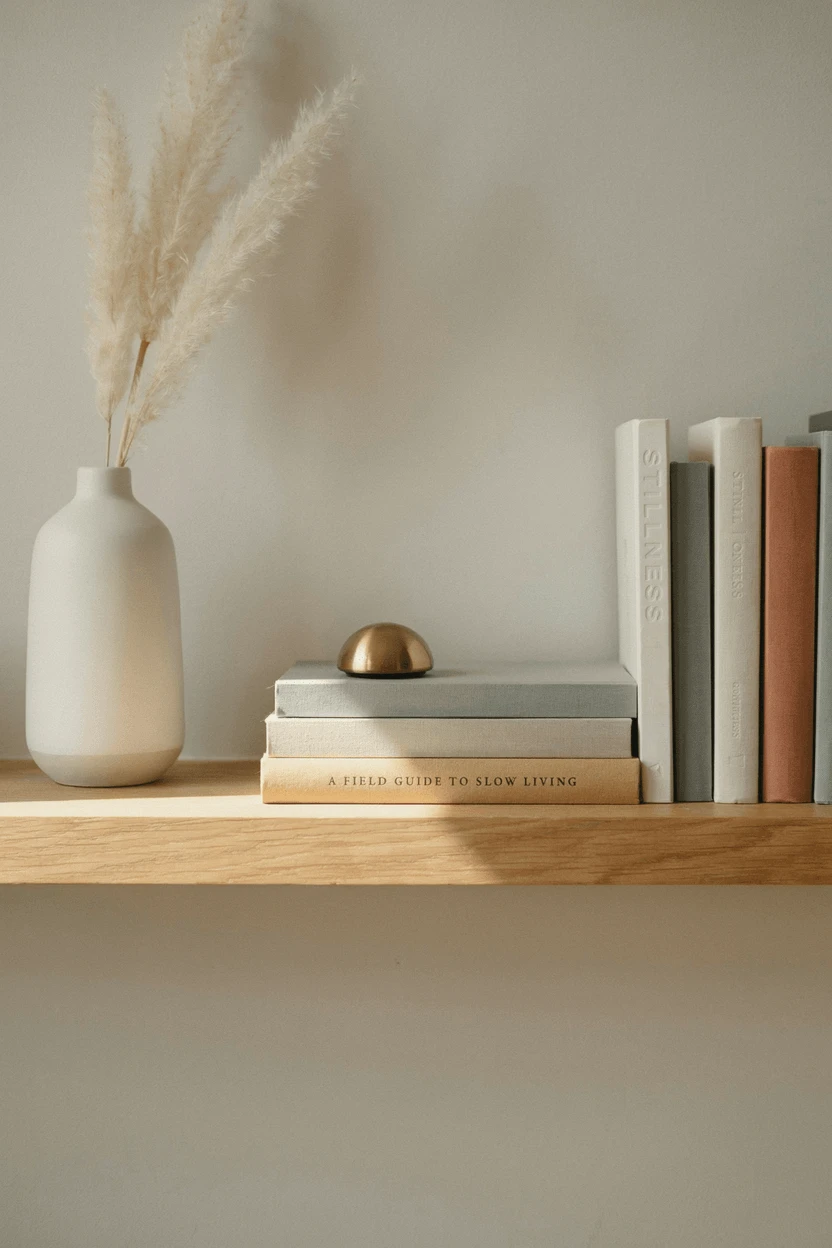
Books are the most flexible element in shelf styling — and most people use them in only one way. Mixing orientations changes everything. Some shelves of vertical books feel natural and readable; adding a horizontal stack here and there creates a platform for smaller objects to sit on — a candle, a small sculpture, a little plant — and breaks the visual monotony of a uniform lineup.
Organizing books by color creates a striking visual effect and works particularly well in living rooms and spaces where aesthetics take priority. In a home office or library where you actually reach for books regularly, subject organization makes more practical sense. A workable middle ground: organize by subject, then arrange by color or size within each group.
Facing the occasional book cover-out rather than spine-out adds variety and lets you display books you love visually — art books, travel photography collections, beautifully illustrated editions. This also takes up more horizontal space, which is useful when you have fewer books to fill a shelf.
Choosing and Placing Decorative Objects
What you choose to display reveals something about you — and that's a good thing. Personal items carry more visual interest than generic filler objects bought solely for the purpose of filling shelves. A travel souvenir, a piece of handmade pottery, a family photograph in an interesting frame — these objects have a quality that mass-produced styling props simply don't.
Scale matters significantly. One large statement piece — an oversized vase, a substantial sculpture, a framed print leaning against the back wall — can anchor an entire shelf. Surround it with smaller supporting objects and the arrangement gains the collected-over-time quality that makes shelves feel genuinely personal rather than assembled all at once.
| Category | Examples | Styling Purpose |
|---|---|---|
| Natural Elements | Driftwood, shells, stones, plants | Add organic texture and warmth |
| Functional Objects | Vintage clocks, globes, binoculars | Provide conversation starters |
| Art and Frames | Small paintings, photos, prints | Break up horizontal lines |
| Collectibles | Figurines, pottery, souvenirs | Showcase personality and interests |
Group objects in odd numbers — threes and fives — rather than even pairings. Odd-numbered clusters feel more dynamic and naturally pleasing to the eye. Two identical vases side by side looks intentional but formal; three objects of varying heights looks curated and collected.
Texture, Layering, and Depth
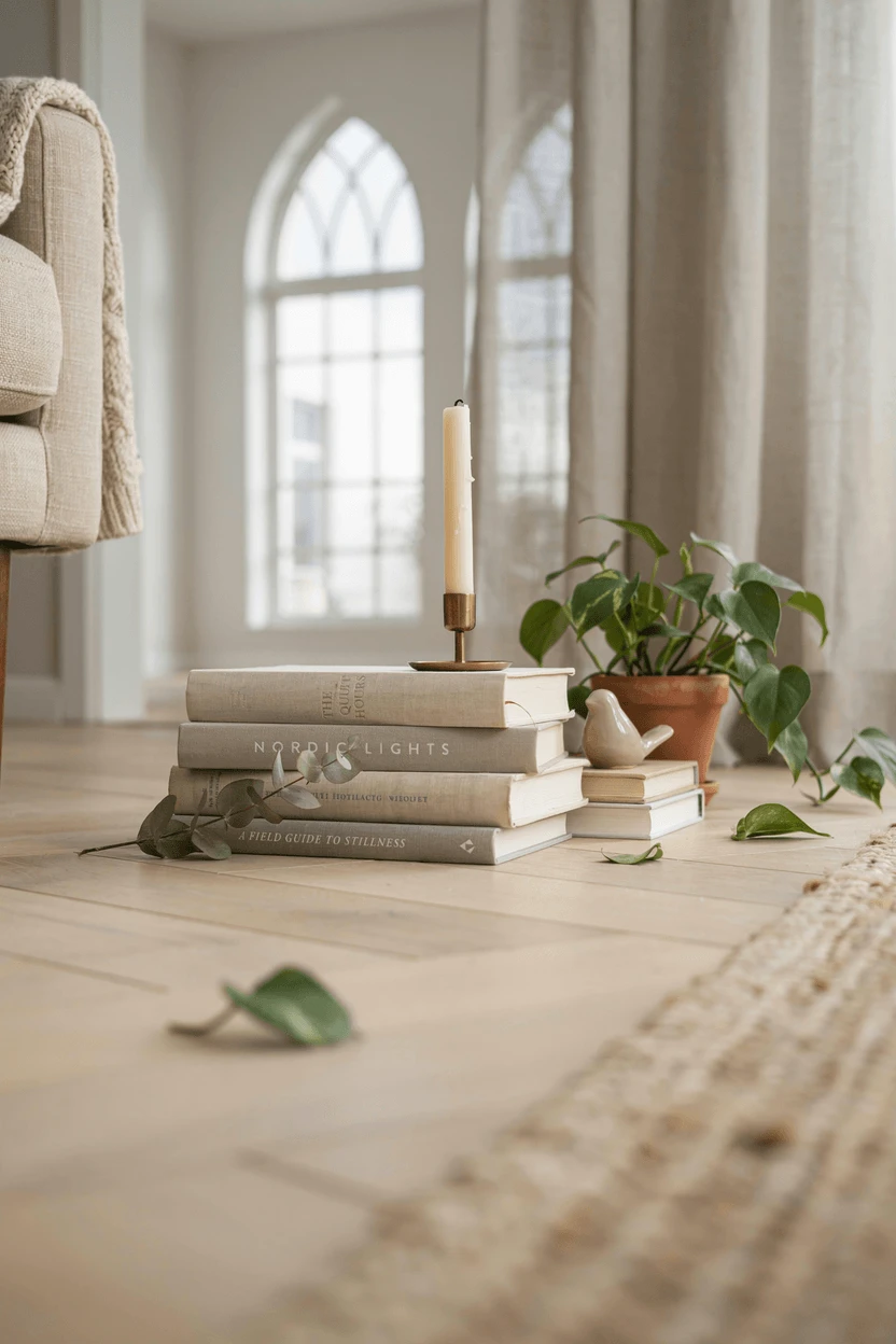
A shelf where everything sits at the same depth — pushed flush to the front edge — looks flat and one-dimensional. Layering changes that entirely. Place some objects toward the back of the shelf, others closer to the front. Lean artwork against the back wall with smaller items arranged in front of it. This creates a sense of depth that makes a shelf feel like a styled vignette rather than a lineup.
Texture contrast is equally important. Smooth ceramic against rough woven baskets, the grain of natural wood against polished glass, soft plants against hard-edged books — these contrasts give the eye somewhere to move and make the overall arrangement feel more interesting than a collection of similar surfaces would.
Height variation keeps the eye traveling. If everything sits at the same level, the arrangement feels static. Mix tall candlesticks with short bowls, stacked books with single upright volumes, a tall plant with a low stone object. The rhythm of up, down, up, across the shelves is what gives a display its energy.
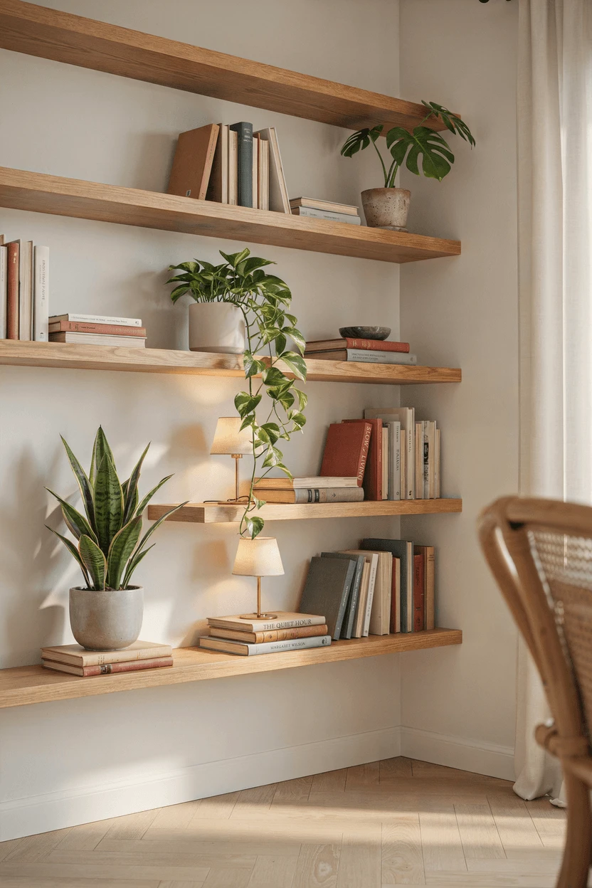
Common Bookshelf Decor Mistakes to Avoid
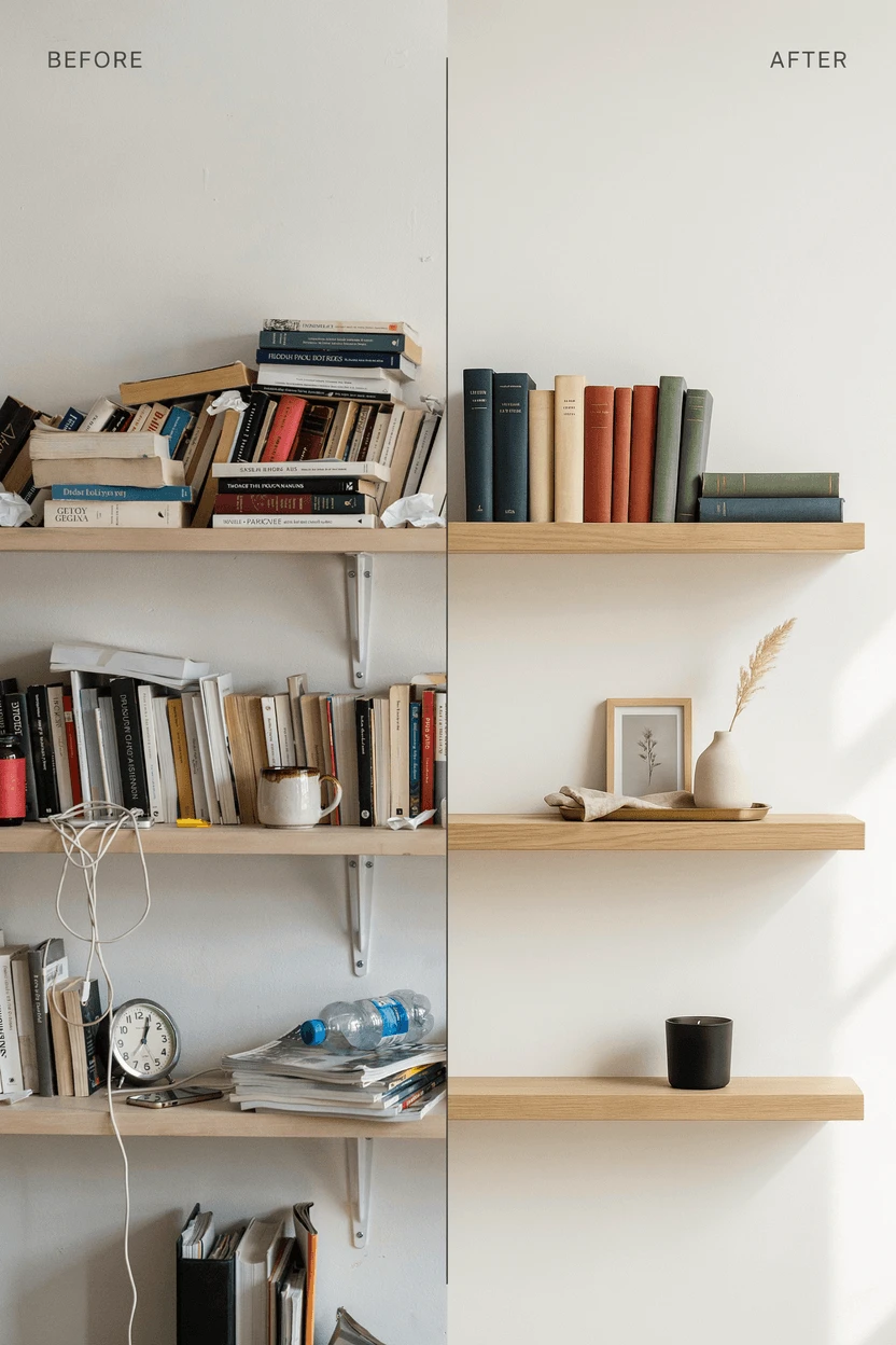
Filling every inch of space is the most frequent error. Negative space isn't wasted — it's what allows the eye to rest and actually appreciate what's there. When everything is crammed together, nothing stands out. As a rule of thumb, place everything you think you want on the shelf, then remove roughly 20%. That edit almost always improves the result.
Ignoring the back wall is a missed opportunity. The back of a bookshelf is part of the display, not just a backdrop. Painting it a contrasting color, lining it with wallpaper, or even ensuring it's clean and well-lit makes a significant visual difference. A warm-toned back wall behind light-colored objects, or a dark back wall behind pale ceramics, adds instant depth.
Forgetting lighting undermines even the most thoughtful arrangement. A shelf in a dim corner will never look its best regardless of how well it's styled. Small LED puck lights on upper shelves, a nearby floor lamp, or repositioning the unit closer to natural light can transform how the whole display reads.
Placing everything the same height and at the same depth creates the flat, one-dimensional look that makes shelves feel uninspiring. These two habits — sameness in height, sameness in depth — are the easiest to correct and make the biggest visual difference when addressed.
Themed Bookshelf Ideas That Work
A cohesive theme can pull everything together in a way that feels purposeful without being heavy-handed. The key in any themed approach is restraint — a few well-chosen pieces communicate an idea far more effectively than covering every surface with it.
Coastal bookshelf decor works through suggestion rather than literalism. Weathered wood frames, a few shells or coral specimens, rope-wrapped objects, and a palette of whites, sandy neutrals, and muted blues evoke the feel of a coastal space without requiring anchors and life preservers. Keep the palette limited and the objects natural.
Fantasy and dragon bookshelf decor suits collections of fantasy novels and related objects beautifully. A sculptural dragon bookend, a few well-chosen figurines, and books displayed face-out to show illustrated covers — this approach anchors the aesthetic without making the shelf feel like a themed display case. The books do most of the work; the objects simply underscore them.
Minimalist shelving works by editing aggressively and choosing quality over quantity. Two or three considered objects, plenty of open space, consistent tones, and books arranged with discipline. Every item earns its place or doesn't make the cut.
Seasonal rotation keeps any themed shelf feeling fresh without a full overhaul. Swap a few objects — a summer arrangement might include lighter colors and natural textures like shells or dried grasses; an autumn version could bring in warmer tones, pinecones, or richly colored ceramics. Most of the shelf stays the same; small changes shift the mood.
Lighting and Practical Styling Improvements
Lighting is one of the most underestimated elements in shelf styling. A beautifully arranged shelf in poor light reads flat and forgettable. Small LED puck lights installed on the underside of upper shelves cast a warm glow that adds dimension and makes colors and textures come to life. If hardwired lighting isn't practical, rechargeable battery-powered options work surprisingly well and require no installation.
Natural light is the ideal, but it comes with one caveat: prolonged direct sunlight fades book spines and can discolor some materials over time. Position shelves near natural light sources, but be mindful of anything particularly susceptible to UV exposure.
A few other practical habits that make the styling process smoother:
- Start with the largest items first. Place substantial pieces — tall vases, large sculptures, big books — then fill in around them. This prevents running out of room for your statement pieces after smaller objects are already placed.
- Use books as risers. A stack of two or three horizontal books creates an elevated platform for smaller objects, adding height variation without any additional accessories.
- Weight the bottom shelves. Placing heavier, darker, or larger objects on lower shelves creates a visually grounded, stable feeling. Upper shelves can handle lighter, airier pieces.
- Consider the sides. If your bookshelf has exposed sides visible from a seating area or doorway, think about how it reads from that angle. A trailing plant or a small object that extends slightly beyond the edge softens the hard line of the frame.
- Step back frequently. What looks right up close often reads differently from across the room. Move several feet away at each stage to check how the arrangement reads at normal viewing distance — this is where most final adjustments happen.
FAQ
How often should I dust my bookshelf decor?
Every two to three weeks is a reasonable rhythm for open shelving. Books and decorative objects collect dust quickly, and letting it build makes cleaning harder over time. A microfiber cloth handles most surfaces well; a soft brush works better for intricate objects or the top edges of book pages. Regular light maintenance is far easier than periodic deep cleaning.
Can I mix different decorating styles on the same bookshelf?
Yes — eclectic can look genuinely sophisticated when there's a connecting thread. That thread might be a consistent color palette, similar materials, or a tonal range that ties different objects together. Without any unifying element, mixed styles tend to look random rather than curated. One cohesive element is usually enough to hold it all together.
What's the best way to incorporate plants into bookshelf styling?
Choose plants suited to the light your shelves actually receive. Pothos, snake plants, and ZZ plants handle lower light well. Vary pot styles and heights, and consider trailing plants on upper shelves for a natural cascading effect. Use pots with drainage or place nursery pots inside decorative covers to protect the shelf surface from water damage.
How do I style a bookshelf without many books?
Good bookshelf decor doesn't require a large book collection. Baskets provide hidden storage and add texture. Larger decorative objects fill space with more visual interest than many small ones. Facing books cover-out rather than spine-out takes up more horizontal space and lets illustrated editions become part of the display. The principles of balance, varied height, and negative space apply regardless of how many books are involved.
Should I organize books by color or by subject?
Color organization creates a strong visual impact and suits living rooms and spaces where aesthetics are the priority. Subject organization makes more practical sense in home offices and libraries where you actually reach for books regularly. A reasonable middle ground: organize by subject, then arrange by color or size within each section. You get navigability with some visual order.
What shelf depth works best for displaying objects?
Standard bookshelves run 10–12 inches deep, which suits most books and decor items well. If you're choosing a new unit and prioritize styling flexibility, 12–14 inch depth gives more room for layering objects front to back. Shallower shelves (8–10 inches) work in compact spaces but limit your ability to create depth, which is one of the key elements of a well-styled arrangement.
Final Thoughts
Styling a bookshelf well is part art, part experimentation, and mostly permission — permission to move things around, to remove what isn't working, and to trust that the process takes a few iterations before it lands somewhere that feels right.
What works in a magazine feature won't always suit your collection, your room, or your personal aesthetic. That's the point. The best bookshelf decor is the kind that feels genuinely yours — a reflection of what you've read, where you've been, and what you find beautiful when you look at it.
Start with the principles here, photograph each version so you can compare and adjust, and give yourself room to edit. Take things away before adding more. Step back often. The shelf that makes you smile every time you walk past it is never the one where every inch was filled — it's the one where everything that stayed was worth keeping.