
Dining Room Wall Art: Complete Guide to Choosing the Right Pieces
Posted by graues on 10.04.26
Dining Room Wall Art: How to Choose the Perfect Pieces for a Finished, Beautiful Space
A dining room feels complete when everything works together — the table, the chairs, the lighting, and the walls. Bare walls can make even a well-furnished space feel unresolved, like something is missing but nobody can quite name it. The right dining room wall art fills that gap: it sets the mood, softens the room, and gives guests something to notice before the food even arrives.

Choosing well isn't complicated, but it does require thinking about scale, proportion, color, lighting, and what actually appeals to you. This guide walks through all of it — from sizing artwork to your walls and furniture, to avoiding the most common hanging mistakes, to building a dining room that feels genuinely finished.
Key Takeaways
- Art above furniture should span roughly two-thirds to three-quarters the width of the piece below it.
- Hang artwork so the center point sits around 57–60 inches from the floor — slightly lower works well in dining rooms where people are often seated.
- Art should complement your room's color undertones, not match every element exactly.
- Lighting — both natural and artificial — changes how artwork looks. Test before committing.
- Leave breathing room around each piece. Strategic empty space makes art feel intentional, not crowded.
Why Dining Room Wall Art Matters
Dining rooms are gathering spaces — places where people slow down, share meals, and talk. Unlike hallways or utility spaces, the dining room invites people to sit and look around. That makes the walls more important here than in almost any other room in the house.
A thoughtfully chosen piece of art can set a tone before a single word is spoken. It can make a formal dining room feel sophisticated, a farmhouse space feel warm and lived-in, or a modern room feel clean and considered. Done well, it creates atmosphere without trying too hard.
The key is connection without coordination. Art should feel like it belongs in the room — informed by the same sensibility as the furniture and finishes — without looking like it was selected from the same catalog page. Rooms that feel overly matched tend to lack personality. The most memorable dining rooms have walls that feel curated, not assembled.
Understanding Scale and Proportion
Going too small is the single most common mistake in dining room wall art. A small print on a large wall doesn't look humble or understated — it looks like a placeholder. The art gets lost, and the wall still feels empty.
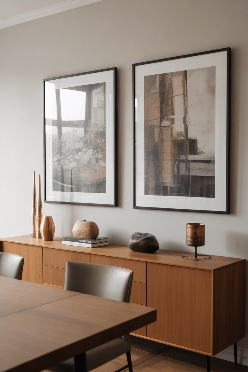
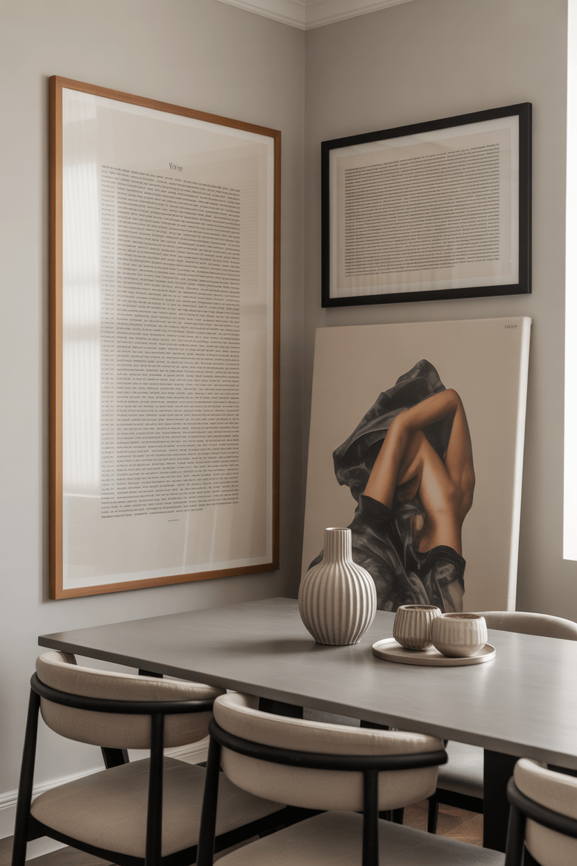
A reliable starting point: art hung above a buffet, sideboard, or console should span roughly two-thirds to three-quarters of the furniture's width. A sideboard that's 60 inches wide pairs well with a piece (or grouping) that's around 40–45 inches wide. This creates visual balance between the wall and what sits below it.
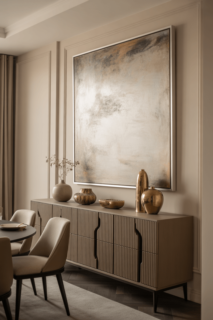
For open walls without furniture anchoring them, large dining room wall art becomes even more important. A single substantial piece — 36 inches wide or more — tends to have more impact than a collection of small works scattered across the surface. If you prefer a multi-piece arrangement, treat the group as a single visual unit and size accordingly.
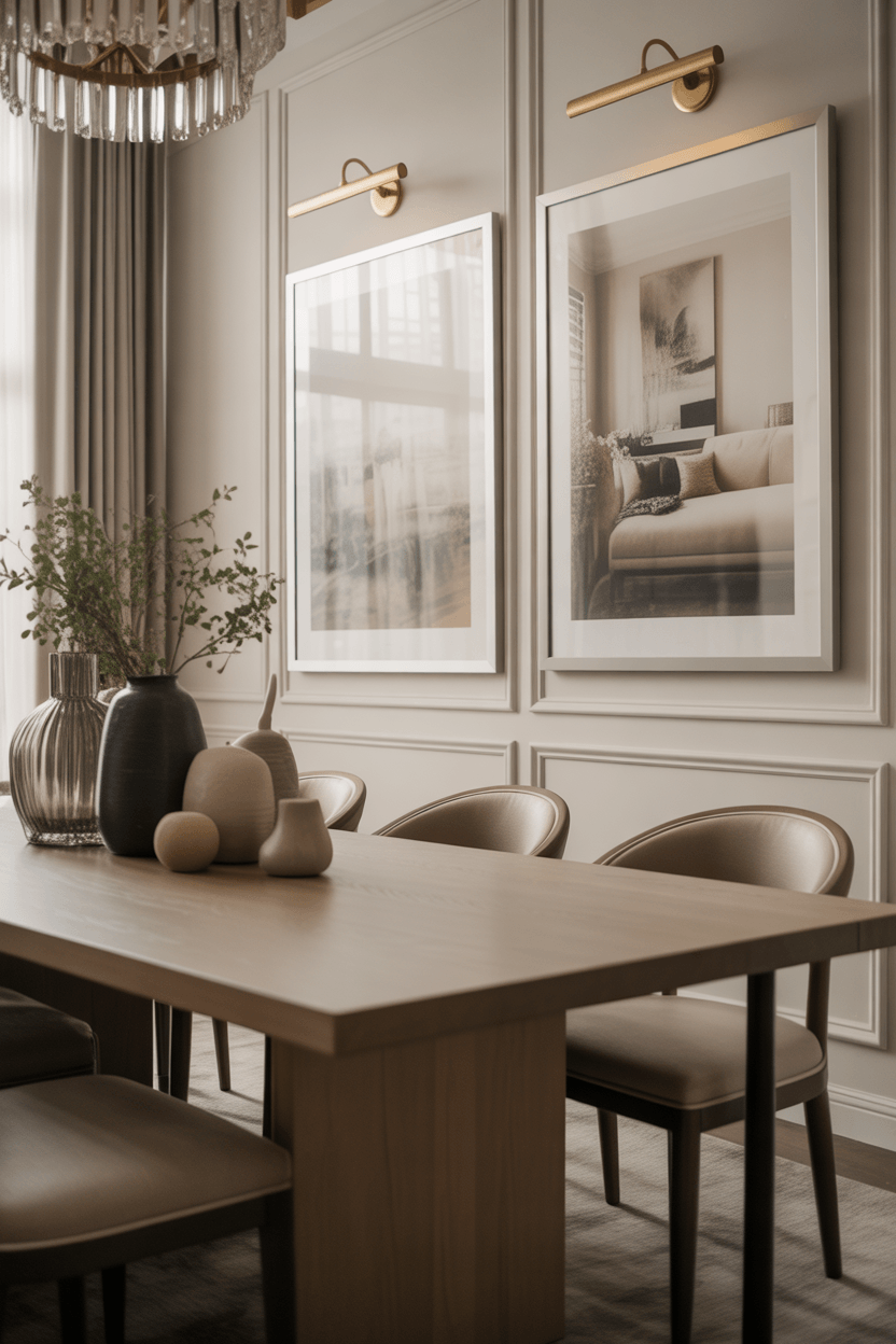
Ceiling height matters too. High ceilings can handle taller, more vertically oriented pieces or stacked arrangements that draw the eye upward. Standard eight-foot ceilings work better with horizontal or square formats that don't feel cramped. And if your room has architectural details like crown molding, chair rails, or wainscoting, work with those lines rather than against them.
Choosing Art for Different Wall Sizes
Not every dining room wall is the same, and different configurations call for different approaches.
Compact dining rooms benefit most from one well-chosen statement piece rather than multiple smaller works competing for attention. A single strong piece adds visual presence without making the room feel crowded. Keep the frame simple and the subject relatively calm — busy or highly detailed art can feel overwhelming in a small space.
Large dining rooms can handle more: gallery arrangements, diptychs, triptychs, or oversized single pieces that anchor an entire wall. The challenge here is avoiding under-filling — rooms with generous wall space often need more art than feels instinctive at first.
Walls above a buffet or sideboard have a natural anchor point. Use the furniture width as your proportion guide, and leave six to ten inches of visible wall between the top of the furniture and the bottom of the artwork. This gap creates a visual breath without disconnecting the two.
Tall walls with high ceilings can support stacked arrangements or large vertical pieces. Consider a pair of tall, narrow prints flanking a central piece, or a vertically oriented canvas that commands the full height of the wall.
Narrow walls and architectural interruptions — like walls between doorways or small panels beside windows — often work best with a single piece that fits the space naturally, rather than forcing a grouping where the proportions don't quite work.
Color Coordination Without Overthinking It
Art doesn't need to match your dining chairs, curtains, or tableware. In fact, when it does, the room tends to feel more like a showroom than a home. The goal isn't matching — it's complementing.
Look at the undertones already present in the room: the warmth of wood tones, the coolness of grey walls, the softness of a cream linen chair, the depth of a dark tile floor. Art that shares one or two of those undertones will feel connected to the space, even if the colors are entirely different. A room built on warm creams and walnut wood can carry a rich teal or terracotta painting beautifully. A cool grey and white room comes alive with warm metallics or saturated jewel tones.
One important variable that's easy to overlook: lighting. Natural light and artificial light can change the way a piece looks significantly. A canvas that feels vibrant in daylight might look flat under warm tungsten bulbs in the evening. If possible, view artwork — or good print samples — in your actual dining room at different times of day before committing. Many online retailers and galleries offer return policies or home trial options for this reason.
Metallics — gold, brass, bronze, brushed silver — work in almost every dining room palette. They catch light, add warmth or coolness depending on tone, and tend to feel refined without being heavy-handed.
Choosing the Right Material, Frame, and Finish
The medium matters as much as the image. Different materials bring different textures, weights, and levels of formality — and some are better suited to dining rooms than others.
| Art Type | Best For | Style Feel | What to Check Before Buying |
|---|---|---|---|
| Canvas prints | Casual, contemporary, large walls | Relaxed, textured, modern | Print resolution; stretched vs. gallery-wrapped |
| Framed prints / photography | Formal, minimalist, traditional rooms | Refined, structured, polished | Anti-glare glass if near windows; UV protection |
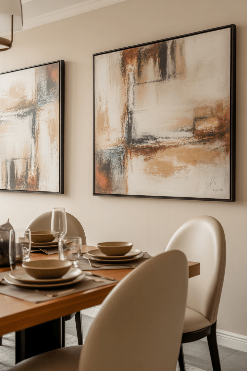
| Abstract paintings | Adding color and movement | Expressive, layered, versatile | Texture and brushwork in person if possible |
| Metal wall art | Contemporary, industrial, transitional | Dimensional, sculptural, striking | Weight and wall anchoring requirements |
| Wood wall art | Farmhouse, rustic, warm interiors | Natural, tactile, grounded | Humidity sensitivity; finish durability |
| Textile / mixed media | Eclectic, bohemian, layered rooms | Soft, handmade, personal | Dust and moisture sensitivity in dining areas |
Canvas dining room wall art has no glass, which means no glare — a real advantage in dining rooms with overhead lighting or windows. Framed dining room art behind glass looks more formal and offers better protection for the piece, though anti-reflective glass is worth considering if there's a light source opposite the wall.
Textiles and unprotected paper works are beautiful but can be vulnerable to steam, splashes, and humidity — all common in dining spaces. If you love the look, position them away from the table's immediate zone, or choose protected versions.
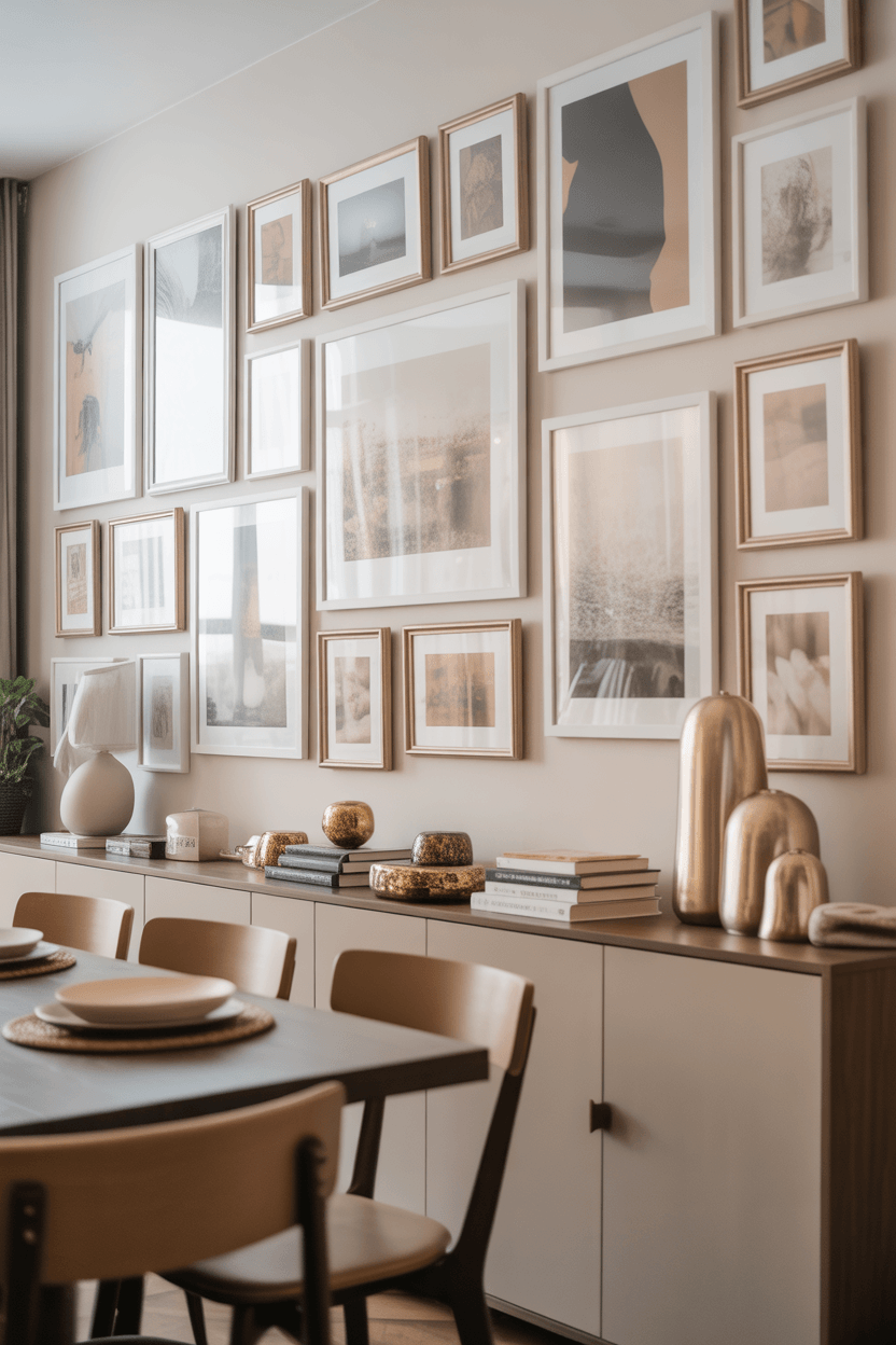
Gallery Walls and Mixed Art Arrangements
A well-planned gallery wall dining room arrangement can be one of the most characterful things in a home. It takes a little more planning than a single piece, but the result — when done thoughtfully — looks curated and personal rather than cluttered.
A few principles that make the difference:
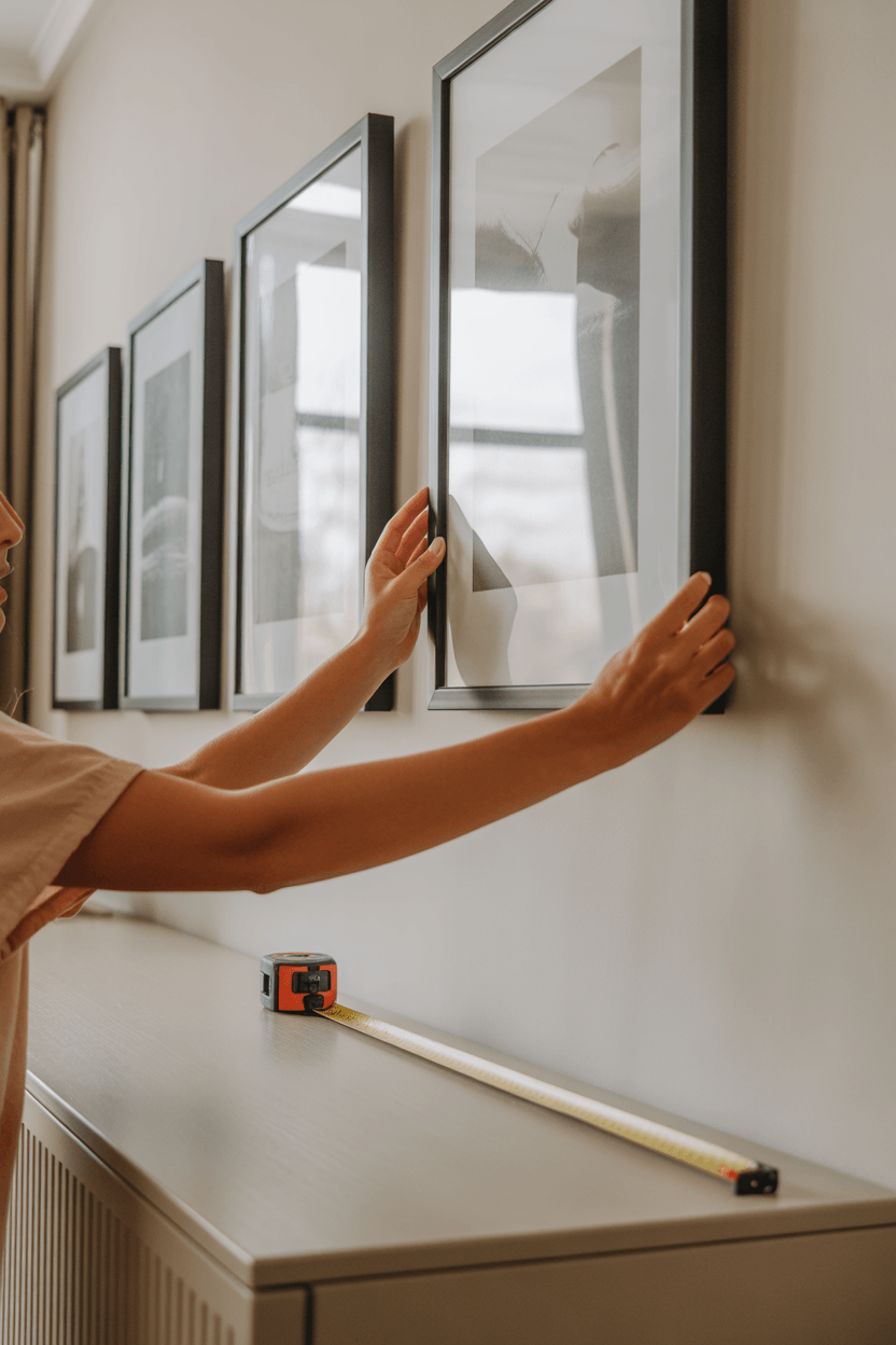
- Plan on the floor first. Arrange your pieces on the ground before touching the wall. Photograph it from above and live with it for a day or two before committing.
- Keep spacing consistent. Two to three inches between frames gives the arrangement a curated, intentional feel. Larger gaps start to feel disconnected; smaller gaps can feel crowded.
- Start with the anchor piece. Hang the largest or most central piece first at the correct height, then build outward from there.
- Mix mediums carefully. A vintage oil painting next to a modern photograph next to a textile piece can work beautifully — as long as there's a unifying element holding the group together.
- Find one unifying thread. This could be frame tone (all black, all natural wood, all gold), a shared color palette, similar subject matter, or consistent visual rhythm. One connecting element is enough to make a mixed arrangement feel intentional.
The outer edge of the arrangement should form a loose geometric shape — a rectangle, a square, or a gently organic cloud — rather than a scattered, unpredictable pattern.
Finding Inspiration Without Copying a Showroom
Inspiration is genuinely useful. Browsing interiors, museum collections, and design publications helps you understand what resonates with you stylistically — and what doesn't. The problem comes when a dining room starts to look like it was assembled directly from a catalog, with no room for anything personal or unexpected.
The most interesting dining rooms have walls that reflect something specific about the people who live there: a painting brought back from a trip, a print from a local artist, a black-and-white photograph of somewhere meaningful. These pieces don't need to be expensive or rare — they just need to mean something.
For exploring different art movements, historical styles, and visual approaches before committing to a direction, the Metropolitan Museum of Art offers excellent art and visual inspiration resources that can help you develop a more informed sense of what you're drawn to — and why.
Use inspiration as a starting point. Then make choices that are actually yours.
Hanging, Hardware, and Safety Basics
The mechanics of hanging art are often rushed, but getting this right makes a meaningful difference to how the room looks — and keeps artwork (and people) safe.
Hanging height: The standard is to center artwork at around 57–60 inches from the floor, which aligns with average standing eye level. In dining rooms, where guests are often seated, dropping this slightly — to around 54–57 inches at center — can feel more comfortable for viewing from the table. What to avoid is the very common habit of hanging art too high, where it floats above eye level and feels disconnected from the rest of the room.
Spacing above furniture: Leave roughly 6–10 inches between the top of a buffet, sideboard, or console and the bottom of the artwork. This creates a visual connection between the wall and the furniture without making the piece feel crowded or perched.
Hardware: For pieces under 10 pounds, quality picture hooks and sawtooth hangers are usually sufficient. For heavier pieces, D-rings and picture wire provide better stability. Wall anchors rated for the weight of the artwork are important for any piece going into drywall without a stud. For practical home safety anchoring guidance — particularly useful in homes with young children or in areas with seismic activity — the Consumer Product Safety Commission offers detailed recommendations.
A simple trick before hanging: cut paper templates to the exact dimensions of each piece and tape them to the wall. Live with the layout for a day or two before committing. It's the fastest way to test scale and placement without making extra holes.
Common Mistakes to Avoid
- Choosing art that is too small. A piece that looks fine on a website can disappear entirely on a large dining room wall. Always check the dimensions against your actual space before ordering.
- Hanging art too high. The floating-above-the-furniture look is one of the most common and most easily avoided problems.
- Matching everything too perfectly. A room where art, chairs, curtains, and tableware all share exactly the same tones looks assembled rather than collected.
- Ignoring lighting. Artwork that looks beautiful in daylight can appear flat or washed out under evening dining lighting. Plan the lighting before the art, not after.
- Using too many small pieces on a large wall. A scattered collection of small prints rarely creates the impact of one or two well-scaled pieces.
- Leaving no breathing room. Art needs space around it to read properly. Walls covered edge to edge tend to feel cluttered rather than curated.
- Using delicate materials near the table. Unprotected textiles, paper works, or anything without a sealed or glass-protected surface can be vulnerable to steam and splashes in dining spaces.
- Using inadequate hanging hardware. Weak hooks and undersized anchors are a safety risk, not just an aesthetic one.
- Forgetting the room's function. Art for a dining room should be considered in the context of meals, gatherings, and the mood you want those occasions to have — not just how the room looks in a photograph.
Dining Room Wall Art Ideas by Style
Different interiors call for different approaches. Here's practical starting-point guidance for the most common dining room styles. The right wall art for dining room spaces always starts with understanding the room's existing character.
- Modern dining room — Bold abstract work in a limited palette, oversized canvases, or graphic black-and-white photography. Frameless or minimal frame options work best.
- Formal dining room — Classic oil-style paintings, sophisticated portraiture, or architectural prints in refined gilded or dark wood frames. Scale generously for the formality of the space.
- Minimalist dining room — One carefully chosen piece with generous empty space around it. Line drawings, single-color works, or quiet photography in a simple frame. Less is genuinely more here.
- Farmhouse dining room — Botanical prints, nature photography, wood wall art, or hand-lettered pieces in warm natural or black frames. Texture matters as much as image.
- Traditional dining room — Framed landscape paintings, still lifes, or classic portraiture in ornate frames. A gallery arrangement of similarly framed pieces can work well on a feature wall.
- Scandinavian dining room — Calm, graphic work with muted tones — charcoal, dusty rose, sage, or warm white. Simple birch or black frames. Clean and uncluttered.
- Transitional dining room — A mix of classic and contemporary works, unified by frame tone or palette. This style has the most flexibility and often benefits from an eclectic gallery arrangement.
- Rental dining space — Command strip-friendly frames, lightweight canvas prints, and arrangements that are easy to move and rearrange. Focus on pieces that travel well and work in multiple settings.
Bringing the Whole Dining Room Together
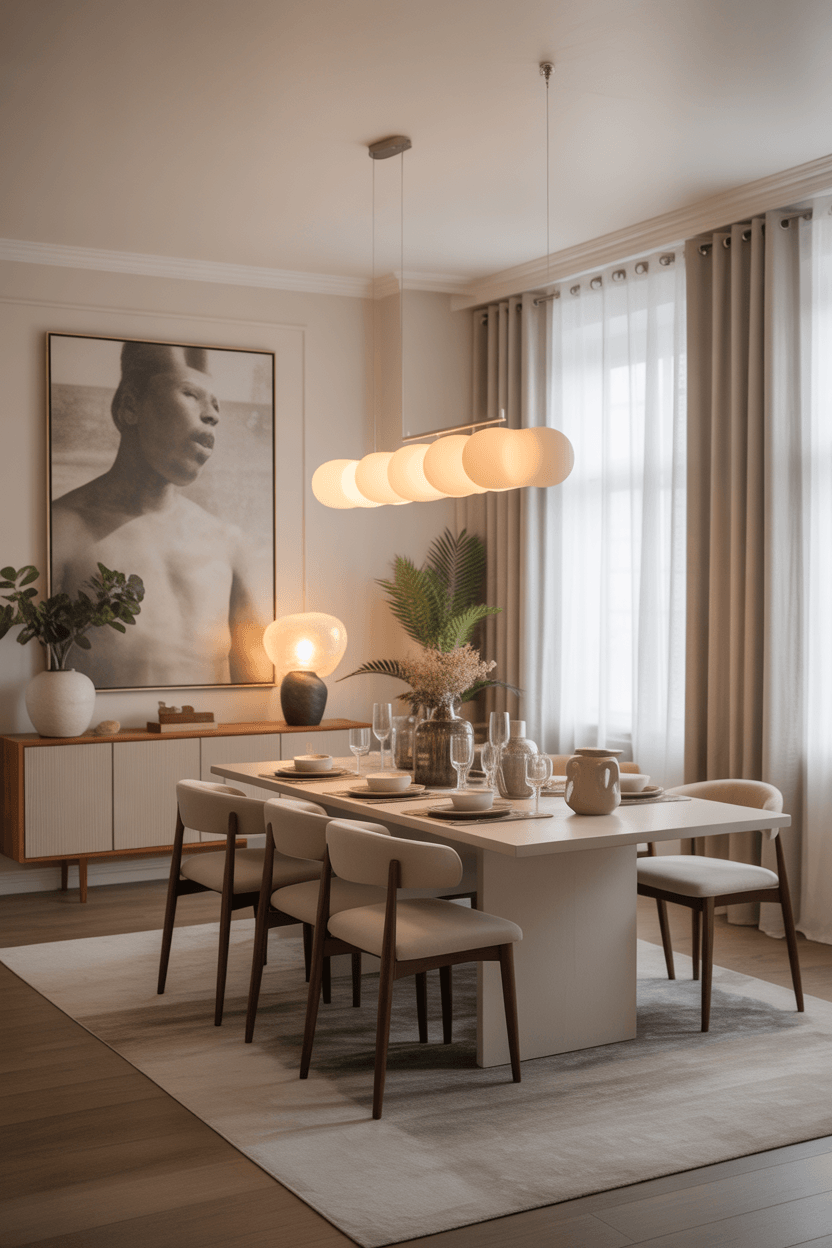
Art doesn't exist in isolation on a wall. In a dining room, it lives in conversation with the dining table, chairs, lighting fixture, rug, sideboard, wall color, and the smaller accessories on shelves and surfaces. Getting this relationship right is what separates a room that looks good in parts from one that feels complete as a whole.
A few connecting principles: the frame finish should speak to at least one other metal or wood tone in the room. The artwork's color palette should echo something — a cushion, a rug thread, the table finish — without duplicating it. The scale of the art should feel proportional to the size of the table and the height of the room.
The goal isn't perfection. It's balance — a room that feels settled, personal, and finished, rather than one that looks like it was installed all at once from a single source. That quality of feeling like things have been gathered over time, each piece chosen for a reason, is what makes a dining room genuinely inviting to be in.
Practical Buying Checklist
- Measure the wall and the furniture below it before selecting any piece
- Aim for art that spans roughly two-thirds to three-quarters of the furniture width below
- Check overall scale against the room — when in doubt, go larger
- Identify the color undertones already present and look for art that complements them
- Consider how the piece will look under both natural daylight and evening dining light
- Choose a medium and frame style suited to the room's formality and moisture exposure
- For gallery walls, plan the layout on the floor first before hanging anything
- Use hardware rated for the weight of the piece — quality hooks, D-rings, and wall anchors
- Leave breathing room around each piece — empty space is part of the design
- Choose pieces you'll enjoy long term, not just ones that match the current season's decor
FAQ
What size art should I hang in a dining room?
For walls above furniture, aim for artwork that spans roughly two-thirds to three-quarters of the furniture width below it. On open walls, a single piece starting at around 36 inches wide tends to read better than multiple small works. In compact dining rooms, one statement piece of 24–30 inches can be more impactful than a group of smaller prints.
How high should dining room wall art be hung?
The center of the artwork should generally sit around 57–60 inches from the floor — the standard gallery height that aligns with average eye level when standing. In dining rooms where guests spend most of their time seated, dropping this slightly to around 54–57 inches at center can feel more comfortable. The key is avoiding the very common mistake of hanging art too high, where it feels disconnected from the furniture and the people in the room.
Should dining room art match my decor?
It should complement, not match. Art that perfectly mirrors the chair upholstery or curtain color tends to feel forced. Look for pieces that share undertones with your existing palette while introducing something unexpected. A connection between the art and the room makes it feel intentional; a perfect match makes it feel assembled.
Can I use family photos as dining room wall art?
Yes — and when done well, personal photographs are some of the most meaningful things you can hang. Presentation matters: quality frames, consistent matting, and a clear visual approach (all black-and-white, for example, or a consistent frame finish) elevate personal photos into something that feels genuinely curated rather than casually assembled. Consider mixing one or two family photographs into a broader gallery arrangement, rather than making the entire wall exclusively personal.
What is the best way to arrange multiple pieces?
Plan the layout on the floor before touching the wall. Maintain around 2–3 inches of spacing between frames for a curated look. Hang the largest or most central piece first at the right height, then build outward. Keep the overall outer edge of the arrangement in a recognizable shape — a rectangle, square, or loose organic form — rather than a scattered, unpredictable pattern.
How do I choose art for a formal versus casual dining room?
Formal spaces traditionally lean toward dining room wall art with more structure and refinement — framed oil-style paintings, sophisticated photography, architectural prints, or classic abstracts in gilded or dark frames. Casual spaces have more flexibility: unframed canvas, eclectic gallery walls, mixed media, and livelier subject matter all work well. These are useful guidelines, not strict rules. A striking modern piece can elevate a traditional room, and a classical painting can anchor a contemporary one beautifully.
Final Thoughts
Walls in a dining room carry more weight than walls in most other spaces — they're the backdrop to meals, conversations, and the small ceremonies of everyday life. Getting them right doesn't require an interior designer or a large budget. It requires understanding a few practical principles and then making choices that genuinely reflect what you like.
Choosing the right dining room wall art starts simply: measure the wall, consider the furniture below it, look at what colors and tones are already in the room, and find a piece that resonates with you. Build from there, one thoughtful addition at a time.
The most beautiful dining rooms aren't the ones where every element was chosen to match — they're the ones where the walls feel as considered, as personal, and as alive as the table set beneath them.