
Lounge Room Wall Art: A Complete Guide to Choosing & Arranging
Posted by graues on 08.04.26
Lounge Room Wall Art: A Complete Guide to Choosing & Arranging
You've painted the walls, arranged the furniture, chosen the cushions—and the room still feels like something's missing. More often than not, the answer is on the walls. Lounge room wall art is one of the most powerful tools you have to make a space feel finished, personal, and alive. But it's also one of the most frequently rushed decisions in home decorating.
![]()
The result? Art that's too small, hung too high, or just disconnected from everything else in the room. Sound familiar? You're not alone—and the fix is simpler than you might think. This guide gives you everything you need to choose art that genuinely works, arrange it confidently, and avoid the mistakes that hold most rooms back.
No design degree required. Just a few practical principles, applied to what you already have.
Key Takeaways
- Scale matters more than style — undersized art is the single most common mistake in lounge rooms
- Great arrangements consider furniture placement, lighting, and viewing angles together
- Mixing frame styles creates visual interest — unity comes from color or theme, not matching sets
- Hang art at a height based on where you actually sit, not standard gallery rules
- Budget-friendly options — large prints, textiles, gallery walls — work just as well as expensive originals
Why Lounge Room Wall Art Matters More Than You Think
Wall art does something furniture can't: it expresses personality. A sofa is functional. A piece of art you love is a statement about who you are and what you find beautiful. In the lounge — the room where you relax, entertain, and unwind — that expression matters.
Beyond aesthetics, art affects how a room feels spatially. A large canvas can make a small room feel more intentional and curated. A gallery wall can transform a long, awkward hallway wall into the most interesting part of the house. And a single well-placed piece above a sofa gives the entire seating area a sense of purpose and completion.
Get the art right, and every other design decision in the room starts to make more sense.
Understanding Scale and Proportion for Lounge Room Wall Art
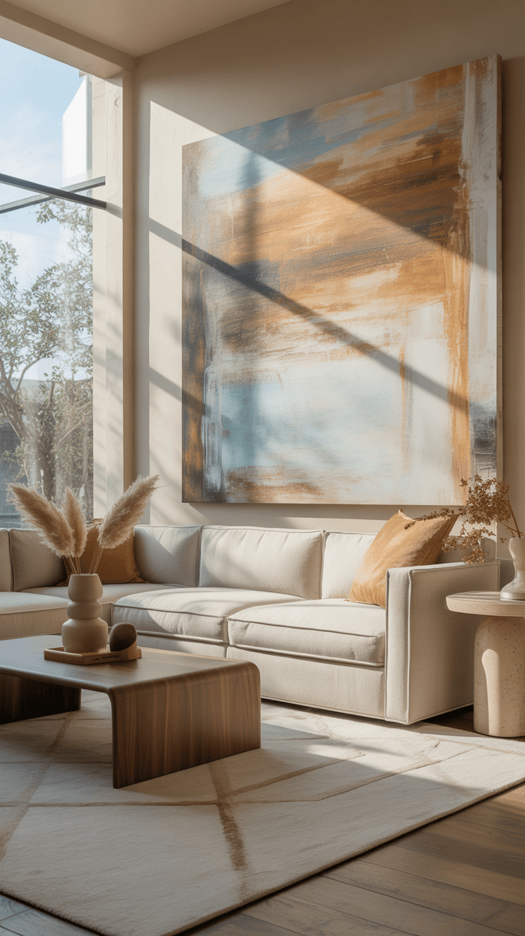
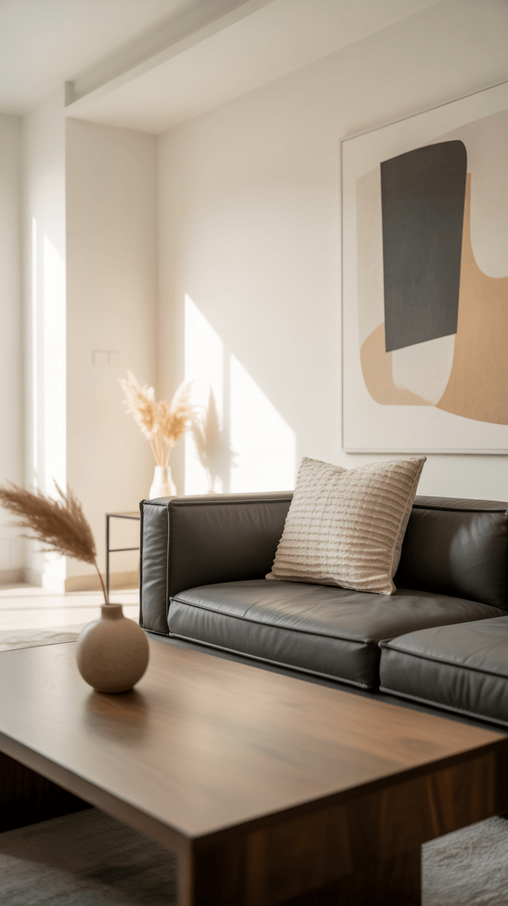
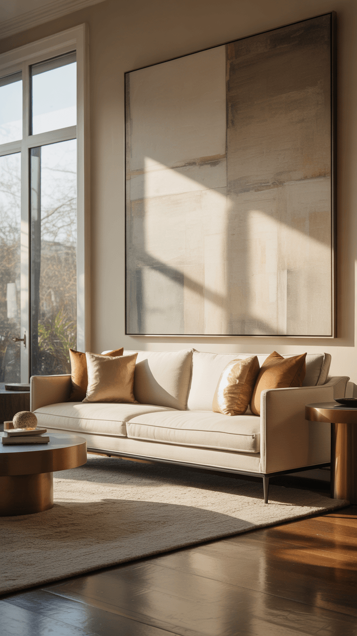
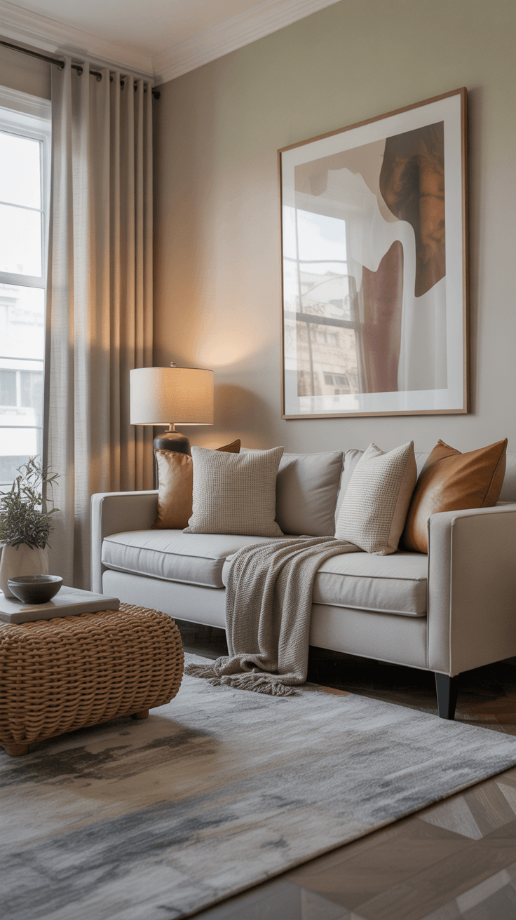
Walk into most living rooms and you'll spot the problem immediately: the art is too small. A single 16×20 print floating above a wide sofa looks lost — no matter how good the image is. The general rule is that art should span roughly two-thirds to three-quarters of the width of the furniture below it. This isn't rigid, but it's a reliable starting point.
Large living room wall art makes a stronger visual impact than clusters of tiny frames, especially in open-plan homes where sight lines travel across multiple zones. That said, bigger isn't always better. A massive canvas in a cozy corner can feel oppressive. The key is matching the art's visual weight to the room's proportions and the furniture anchoring that wall.
Ceiling height is another factor most people overlook. Standard 8-foot ceilings have limited vertical space. In these rooms, horizontal orientations often work better — they match the room's natural proportions. Higher ceilings (10–12 feet) give you room to go vertical, drawing the eye upward and adding drama.
Not sure about size? Cut paper templates to scale and tape them to the wall. Live with them for a day before making any holes.
Choosing Art That Complements Your Space
Color is the natural starting point — and it's a good one — but it's only part of the picture. Yes, pulling an accent color from your art into a throw pillow or cushion creates cohesion. But texture, subject matter, frame material, and mood all play equally important roles in whether a piece feels at home or out of place.
Abstract art is flexible — it doesn't compete with other decorative imagery and works across most interior styles. Landscapes bring calm and suit traditional or transitional spaces well. Photography can feel contemporary or timeless depending on the subject and how it's framed. And don't overlook sculptural pieces or textile art — these add physical dimension that flat prints simply can't replicate.
The frame is part of the composition too. A thin black metal frame reads modern and graphic. A wide timber frame feels warmer and more traditional. Even the same image looks completely different depending on how it's framed, so think of the frame as part of the art, not an afterthought.
Above all: choose what genuinely resonates with you. A piece that makes you stop and look is working — regardless of whether it ticks every technical box.
Modern Lounge Room Wall Art Ideas for Different Styles
The right art for your room depends heavily on the style you're working with. Here's how to approach the most common interior styles:
Minimalist / Modern: Go bold and simple. One oversized canvas with clean lines and a limited palette does more than a cluster of smaller pieces. Black-and-white photography, geometric abstracts, and large typographic prints all work beautifully in modern lounge room wall art setups.
Rustic / Farmhouse: Lean into warmth and character. Vintage botanical prints, black-and-white photography in weathered timber frames, and hand-drawn illustration prints suit these spaces well. Imperfection is part of the appeal.
Transitional: This is the sweet spot between traditional and contemporary. You have the most flexibility here. Layer old and new — a classic landscape in a sleek modern frame, or a contemporary abstract in a traditional gilded frame — for spaces that feel layered and lived-in.
Eclectic: Mixing is encouraged, but even eclectic spaces need a unifying thread. It might be a consistent mat color, a shared tonal palette, or a unified subject theme. Without that thread, a mix of pieces reads as random rather than curated.
The most interesting rooms often have a little intentional contrast — a contemporary piece in a traditional room, or vice versa. That friction keeps things visually alive.

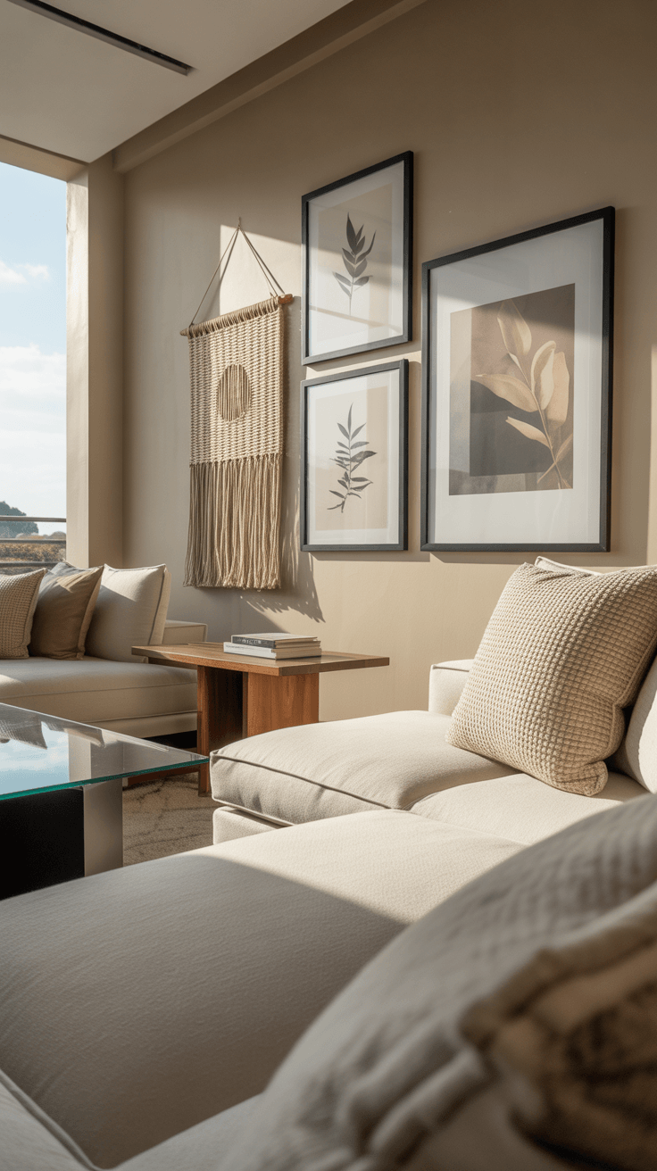
Placement and Arrangement Strategies
The standard gallery rule places art at 57 inches on center from the floor — which approximates average standing eye level. But a lounge room isn't a gallery. If you're seated most of the time you're in that room, art hung at gallery height can feel oddly elevated and disconnected. Adjust based on how and where you actually view it.
Wall art above sofa: Position the center of the artwork 8–10 inches above the sofa back. This creates a visual link between the art and the furniture beneath it. Any higher and the piece starts to float; lower and it can feel cramped.
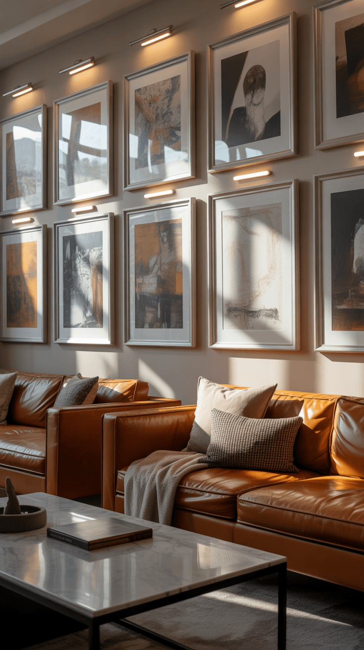
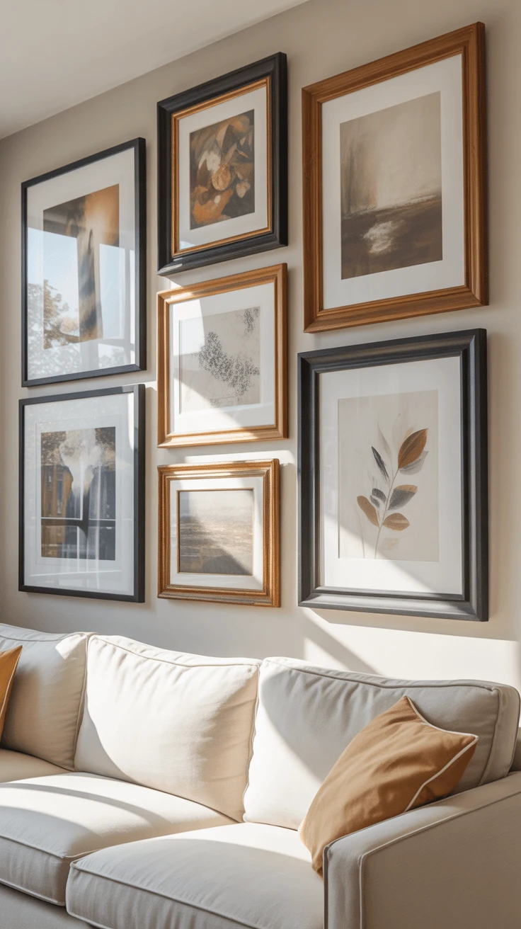
Gallery walls look complicated but are actually forgiving once you understand the structure. Start by laying everything out on the floor first. Maintain 2–3 inches between frames. Keep the outer edges of the overall arrangement contained within an imaginary rectangle — this prevents the "scattered" look that makes gallery walls go wrong. If you're working with a mix of sizes, anchor the arrangement with one or two larger pieces and build around them.
Statement pieces need breathing room. Leave at least 6–8 inches of clear wall on all sides. Crowding art toward corners, doorways, or ceiling lines makes the space feel smaller and the art feel compressed — even in a generous room.
Room-Specific Considerations
Open-plan homes blur the lines between lounge and dining. When these spaces flow into each other, the art in both zones needs to feel related — even if it's not identical. Repeating a color, a frame finish, or a visual theme across both spaces creates cohesion without making everything match.
Wall art for dining room areas tends to work best when it's warm and inviting — think still lifes, warm-toned abstracts, botanicals, or landscape prints. These complement the mood of a meal and conversation without dominating the space. But if your lounge and dining areas flow together, carrying your lounge aesthetic through is perfectly valid. Consistency across an open plan always reads better than a hard stylistic break.
How Lighting Changes Your Room Wall Art
Lighting is one of the most underestimated variables in how art looks on a wall. The same piece can feel vibrant and alive in well-lit conditions, or flat and forgettable in poor light. Natural light is ideal — but it comes with risks. Direct sunlight fades prints and paintings over time, particularly watercolors and photographs, so it is worth learning how to protect framed art from light damage before choosing a permanent wall placement.. For any piece you care about, UV-filtering glass in the frame is a worthwhile investment.
Dedicated picture lighting changes things dramatically. A simple clip-on or hardwired LED picture light throws focused, warm illumination directly onto the art — drawing the eye, adding depth, and making even affordable prints look considered and intentional. Track lighting works well for gallery walls, letting you angle the light exactly where you need it.
LED options are the practical choice: they produce minimal heat (protecting your art) and consume far less energy than halogen alternatives. For room wall art you've invested in — emotionally or financially — proper lighting is the last step that makes everything else work harder.
Budget-Friendly Lounge Room Wall Art Ideas
Original art has its place — but a high price tag is not a requirement for a well-dressed wall. Some of the most effective lounge rooms are built entirely on accessible, affordable options chosen with intention.
Large-format prints: A striking photograph or illustration printed at 30×40 inches costs far less than most framed originals, and at that scale it commands the same visual attention. Frame it simply or mount it on foam board for a floating effect.
Digital art prints: Platforms offering independent artist prints give you access to genuinely original-feeling work at accessible prices. Many ship print-ready, so you just need a frame.
Thrifted frames and estate finds: The frame is often the expensive part. Vintage frames from op shops and estate sales can be repainted or refinished — and often have more character than anything new.
Textile art and wall hangings: Woven pieces, tapestries, and framed fabrics add warmth and texture that flat prints can't. They're also excellent acoustic softeners in hard-surfaced rooms.
Gallery walls on a budget: A mix of postcards, downloaded prints, personal photos, and secondhand finds — unified by frame color or mat style — can look just as curated as an expensive collection.
| Art Type | Best For | Price Range | Considerations |
|---|---|---|---|
| Original Paintings | Statement pieces, investment | $200–$5,000+ | Unique, supports artists, higher cost |
| Limited Prints | Quality and value balance | $50–$500 | Numbered editions, good resale potential |
| Digital Prints | Budget-conscious, trend-led | $20–$150 | Affordable, easily replaced, less collectible |
| Photography | Modern spaces, personal stories | $30–$800 | Wide range; prioritize archival printing |
| Textile / Wall Hangings | Texture, bohemian, warm styles | $40–$400 | Softens acoustics, adds dimension |
Common Mistakes to Avoid
Art that's too small: The most common error by far. If the piece doesn't feel bold enough in the shop, it will feel invisible on the wall at home.
Hanging everything too high: Gallery standard doesn't translate to residential comfort. If you sit in that room, hang art lower than you think.
Buying frames before the art: Do it backwards — find the art you love, then frame it. Buying frames first forces the art to fit the frame, not the wall.
Matching everything perfectly: Pre-coordinated three-piece sets feel generic. Pieces curated over time — even imperfectly — feel personal and collected.
Ignoring negative space: Blank wall isn't wasted wall. It gives your eye a place to rest, and makes the art you do hang feel more intentional and impactful.
Fighting your room's lines: If your space has strong horizontal elements — a wide sofa, a low credenza, horizontal windows — a single tall vertical piece may create visual conflict rather than balance. Work with your room's architecture, not against it.
Practical Tips Before You Hang Anything
- Measure twice, mark once. Tape paper templates to the wall first. Live with the mockup for at least a day before committing.
- Anchor art to furniture. Art should relate visually to what's below it. If you rearrange the furniture, revisit the art placement too.
- Use visual triangles. When arranging multiple pieces, distribute weight in triangular patterns rather than straight lines for more dynamic compositions.
- Mix frame styles intentionally. Vary between thick and thin, wood and metal — but keep finishes within the same color family for cohesion.
- Layer where possible. Lean smaller pieces on mantels or shelves in front of larger hung works for dimensional depth.
- Use proper hardware. Picture hangers rated for your art's weight, and drywall anchors where studs aren't available, prevent sagging and wall damage.
- Consider seasonal rotation. Swapping a few pieces every quarter keeps the space feeling fresh without a full redesign.
- Light it properly. Even budget art looks intentional with a dedicated LED picture light. It's a small investment with a significant visual return.
- Group in odd numbers. Three, five, or seven pieces in a cluster typically reads more balanced than even-numbered groupings.
- Trust your instincts. If a piece makes you stop and look, it's working — regardless of whether it follows any rule.
Frequently Asked Questions
How high should I hang art above my sofa?
Position the center of the artwork 8–10 inches above the sofa back. This creates a clear visual connection between the furniture and the art. If your ceilings are particularly high you can go slightly higher, but always maintain that relationship — art that floats too far above the sofa looks disconnected from the room.
How big should lounge room wall art be?
As a starting guide, art above a sofa should span two-thirds to three-quarters of the sofa's width. For a single statement piece on a large wall, scale up rather than down — undersized art rarely looks intentional, while a confidently sized piece almost always does.
Can I mix different frame colors in one room?
Yes — and it often looks better than perfect matching. The key is an underlying logic: stay within warm tones (gold, brass, timber) or cool tones (black, silver, white) rather than mixing across both families. Variety within a tonal family reads as curated. Variety without any logic reads as accidental.
What type of wall art works in a modern lounge room?
For modern spaces, bold and restrained works best. Oversized abstracts, large-format black-and-white photography, and geometric or typographic prints in clean frames all suit a contemporary interior. One strong piece typically makes more impact than multiple smaller ones.
Is a gallery wall good for a small lounge room?
Yes — when done right, a gallery wall in a small room can make the space feel more intentional and personality-filled rather than cramped. Keep the outer boundary tight and well-defined, use consistent frame tones, and avoid scattering pieces too far apart. A well-structured gallery wall feels curated, not cluttered.
Should lounge room wall art match dining room wall art in an open-plan space?
It doesn't need to match exactly, but it should feel connected. Repeating a color palette, a frame finish, or a visual mood across both zones creates cohesion without everything looking identical. A hard stylistic break between two open-plan spaces can feel jarring — some shared visual thread keeps both areas feeling like part of the same home.
Final Thoughts
The best lounge room wall art doesn't come from following rules perfectly — it comes from choosing what you love, understanding a few guiding principles, and having the patience to get it right over time. Scale, placement, lighting, and proportion all matter. But so does the piece that makes you stop and look every time you walk past it.
If you're feeling overwhelmed, start with one anchor piece. Choose something you genuinely love at the right scale for the wall you have in mind. Everything else can build from there — over weeks, months, or years. The rooms that feel most personal are rarely decorated in a single weekend.
Measure your walls, take note of what you already love in your home, and give yourself permission to experiment. Your walls are waiting — and the right art makes all the difference.